


Why The WaPo Sex Graphs Are Misleading

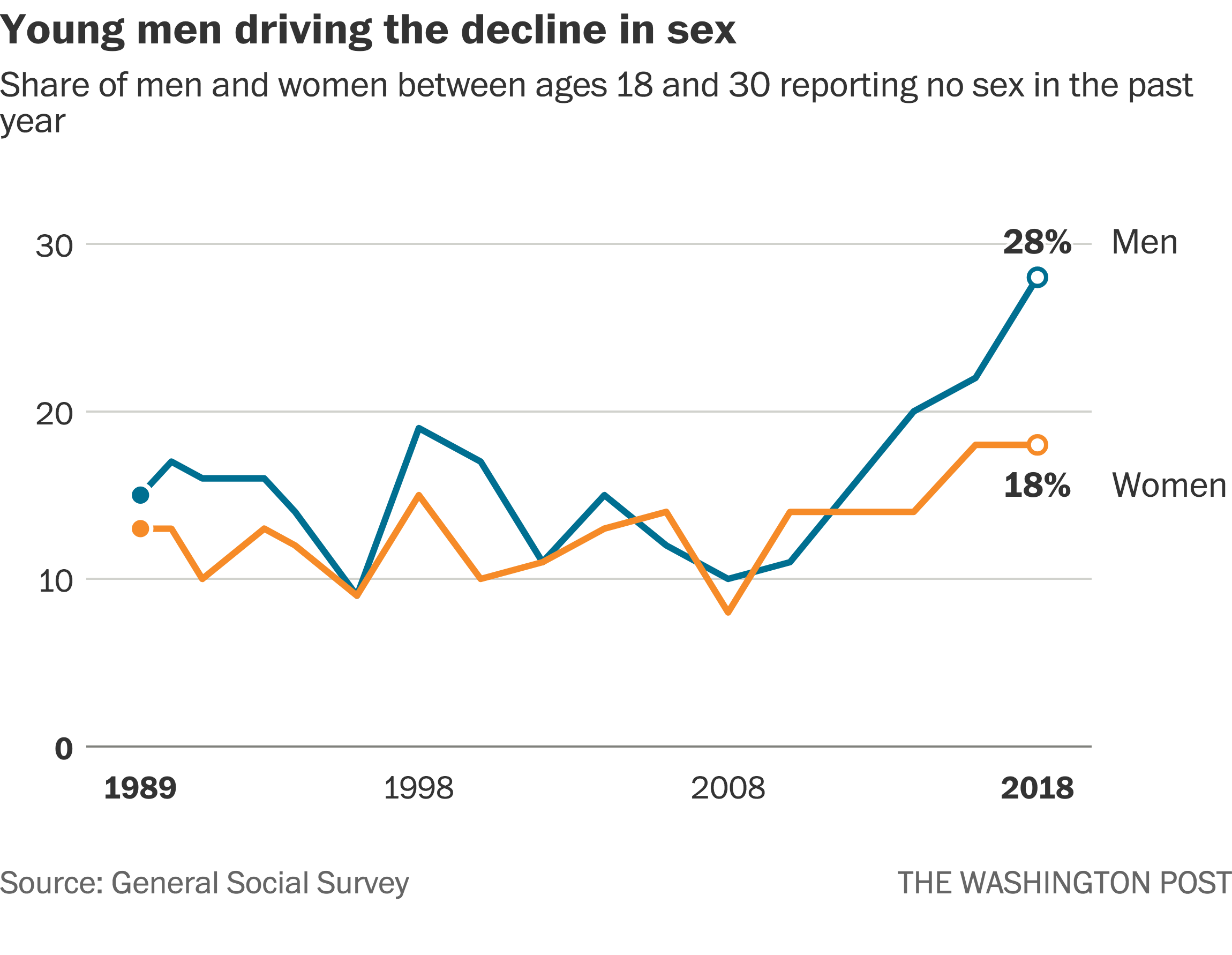
For the past half decade or so, this graph published by The Washington Post and sourced from the General Social Survey has been bouncing around the internet, serving as the basis for many a thinkpiece and debate, and frequently cited by incels and the manosphere more broadly as evidence for escalating sexual inequality between the genders, or a so-called 'chadopoly' effect:
It resurfaced relatively recently and went through another viral phase with a politician using it as the basis for a shameless 'right to sex' publicity stunt:

The first question that comes to mind when it comes to the incel interpretation is 'what took so long?'. The general incel narrative maintains that the sexual revolution is at the root of their struggle, with the unravelling of monogamous norms unleashing women's 'hypergamous nature', and facilitating a 'return' to the imagined days of widespread harems before monogamy was 'invented' and 'enforced' by Christianity or something. How realistic is it that the cultural shifts (alongside the introduction of the pill) that occurred following the sexual revolution in the 60s took multiple generations to have this effect they attribute to it, and so suddenly? Surely we'd have seen some evidence for an increasing skew prior to this survey year, where the biggest gap on record of a somewhat modest 10% is seen.
A likely rejoinder is that dating apps and particularly Tinder have facilitated this process, as it has given women greater 'access' to attractive men within their vicinity. This is quite a weak argument in my view, especially considering their narrative that the '80/20' or '95/5' rule is the natural dynamic that emerges given unrestrained female sexuality. How is it the natural state of mankind if it requires modern technology to facilitate it? There's nothing about a phone app that grants them unique 'access' to more men, they were plenty capable of bumping into attractive men going about their day or at the club etc. before its introduction. I can also demonstrate more specifically how this notion of dating apps facilitating 'chad harems' is false with dating app related data, but that's a topic that will likely be covered in a future post.
Now what about the graph then, why did we see this apparently male-driven spike in 2018?
The first thing to note is that the unweighted sample size for the GSS (General Social Survey) isn't exactly impressive when you narrow it down, in this case to 18-30 males. It was especially low in 2018. There are two questions the survey asks relating to how much sex one had in the past year. The first is the frequency, i.e. how often did you have sex, the second is how many unique sexual partners you had. To the first, a mere 136 18-30 males responded, to the second, 137. So you should be able to see how susceptible it is to statistical noise, especially after the weighting process as it can further amplify the noise if a certain subset being given greater weight experiences noise. This seems to have happened in 2018, as the average amount the rate rises following the weighting process (including the survey preceding and succeeding it) is a bit under 2%, but in 2018 it was 6%.
You'll notice that there are no error bars present on the Washington Post published graph. If there were, you'd notice that the error range at the 95% CI is approximately ±9%, so it's hardly a precise estimate.
Bearing this in mind, we shouldn't be surprised to see that in the very next survey, which was slightly delayed due to COVID but the results came in in 2021:
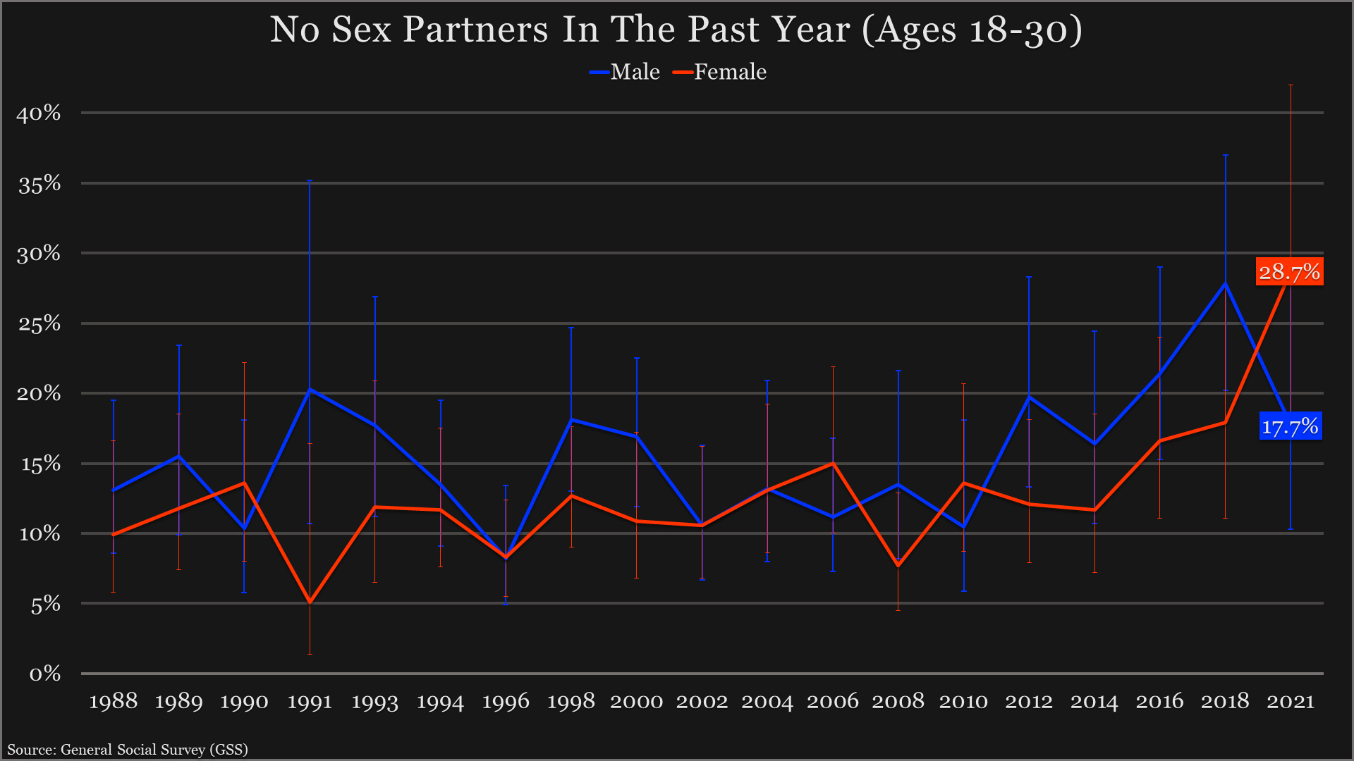
Showed that going by the 'how many sexual partners did you have in the past year' question, this rate dropped from 27.8% to 17.7% (both using the weights provided by the GSS). At the same time, the rate for females rose from 17.2% to 28.4%. So the rates essentially did a switcheroo, forming an X on the graph. While the female rate rising shouldn't be too surprising given that this was in the midst of the pandemic, especially considering women acted more risk aversely such as wearing the mask at higher proportions, the fact that despite this the male rate dropped so sharply indicates to me that we were looking at something of a statistical anomaly in the previous survey.
We don't have to stop there though, as the GSS is not the only nationally representative US survey that deals with sexual activity. Another survey called the National Survey for Family Growth (NSFG), conducted by the CDC, features a sample size some ten times greater than the GSS, and thus is a much more reliable source of data. Between 2011-19, 15,099 straight men and women between the ages of 18-29 were surveyed by the NSFG and answered the related question. Between 2010-18, 1,465 of the same demographic were surveyed by the GSS and answered the related question. What we find is that unlike in the GSS sample where we saw a male-specific (well there was actually a slight female increase that was lost to rounding) increase in sexlessness from 2016-18, the rate for men from 2015-17 (the survey being conducted over a two year time period beginning and ending in September) barely moved, while conversely the female rate rose noticeably:

This shows that the supposedly male-driven nature of the sexlessness trend, which appears to be real if somewhat exaggerated, may be less gender specific after all. I'll add that the rate according to the GSS and looking at this slightly more narrow demographic was 28.4% in 2018 and 20.1% in 2021. It's also worth noting that the question in this NSFG graph relates specifically to vaginal intercourse, while the GSS question appears to be slightly more broad, which may account for the slightly higher rate. Regardless, we can say that the 2018 GSS survey likely exaggerated both the male rate and the male-specificity of the trend.
You will have also no doubt seen this graph floating around, claiming to show 'male virginity' soaring up:
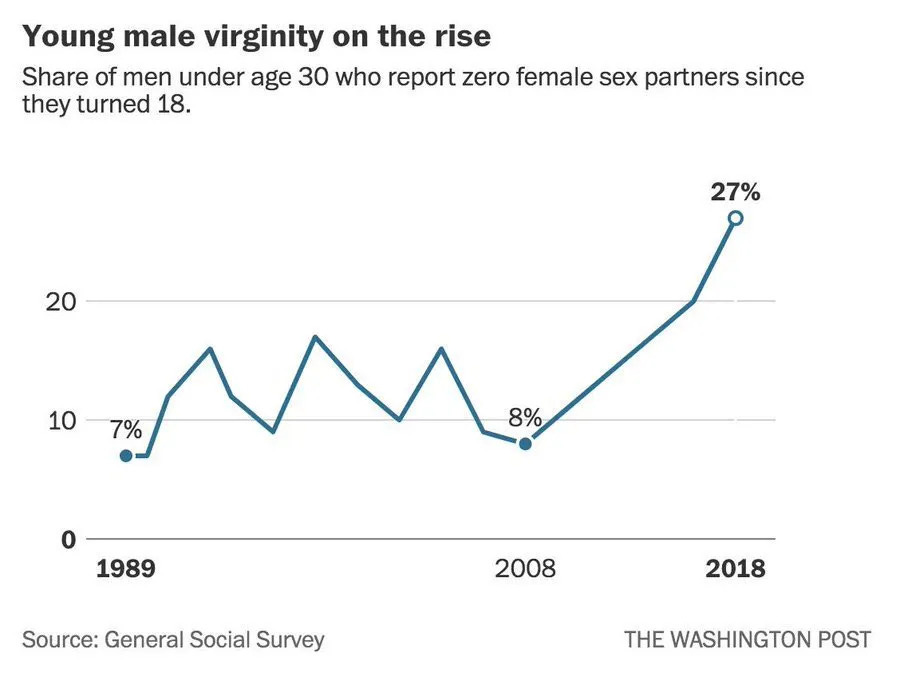
Let's also deal with this for good measure. There's a couple of additional problems with this graph. The first is that they didn't control for sexual orientation, despite the question it used as a proxy, 'Now thinking about the time since your 18th birthday (including the past 12 months) how many female partners have you had sex with?', relating explicitly to opposite-sex partners. The second is that there is a lower cut-off age at 18, unless I suppose they are 18, in which some portion of the sex partners they potentially had while they were 17 would be applicable. This means that sexual encounters before 18 generally won't be captured, which could have an especially significant effect among the younger respondents.
While the GSS doesn't specifically ask about virginity, there is a better proxy in the question represented by the variable 'partnrs5', which asks how many sex partners the respondent has had in the past 5 years. While this is also an imperfect proxy, it reduces the inflation of the virginity rate by a few percent in this age bracket.
This is the resulting graph when also controlling for sexual orientation (somewhat confusingly the 'virginity' graph used an age of 'below 30', presumably 18-29, while the sex in the past year graph used 18-30, so this is directly comparable to the 'virginity' graph, which I'll also add actually rounds its figure up from 26.4%):

So the rate fell from 23.8% in 2018 to 15.6% in 2021. This also happens to line up nicely with the NSFG results, showing that 15.2% of heterosexual 18-29 men reported never having had vaginal intercourse in the 2017-19 survey:

Therefore, what has commonly been used to claim that '1 in 3 young men are virgins' (despite of course even the inflated estimate being closer to 1 in 4), to about 1 in 6 or 7. This is also ignoring the fact that many of these men actually report voluntary reasons for remaining a virgin. For instance, according to the GSS, when you limit the analysis to those who stated having no moral qualms with premarital sex, the sexlessness rate drops by close to half. The NSFG asks directly why respondent's haven't had sex yet. In the 18-29 age bracket, about half of men report religious/moral values, pregnancy/STD risk, and in a relationship waiting for the right time as reasons, while the rest state they either haven't found the right person or 'other'. Of course you could argue that delayed marriage is its own issue, but judging by the overall virginity rates, most of the men abstaining from premarital sex would've had sex if they'd dropped their personal convictions, and thus the truly involuntary virginity rate is lower still. Also, since the virginity rate is heavily weighted towards the lower end of the age bracket, when you get into the 25-30 bracket, only about 4% of men remain virgins. Some people seem to have a bit of an issue understanding this.
All in all, while there is likely a slight to moderate increase in sexlessness among young people (the causes of which are outside the scope of this entry), the 2018 GSS graphs (which are still being peddled today despite more recent data from the same source, and as we've seen more reliable data sources being available) are likely somewhat misleading for a couple of reasons. It does not offer evidence for an escalating chadopoly, and various other facts such as the sex partner counts among the 'top 5/20%' decreasing over time and STD rates not rising disproportionately among women like you'd expect, are also in conflict with it. It should be interesting to see how future surveys pan out. For what it's worth my prediction regarding the GSS is that the male and female rates will more or less meet in the middle. Of course with what we've seen concerning the sample size its potential to fluctuate it's probably not wise to make predictions about it, but what I'm quite confident in is that we won't see another 10% gap. Of course even if we did though, it's not necessarily evidence for the chad harem narrative, but possibly younger women increasingly partnering up with older men as for instance young men are falling behind in certain areas. I'll also note that of the data I've seen from other countries, they also fail to show evidence for a specifically male-driven trend.
Anyway I just thought I'd get this out of the way to start off with. Hopefully it serves as a useful reference.
UPDATE: There has now been another GSS survey, and while my prediction that the male rate would rise and the female would drop didn't pan out, the prediction that they'd meet at basically the same point did. See the next post for the graph.